Creating an effective chart, however, is not simple and requires understanding the basics of human perception as well as charting basics. A 'bad' chart is one that does not tell the story and is not understandable. An even worse chart ('the ugly') is one that conveys a wrong story. Here are some examples from the last week. Try to figure out the story that each of these charts are telling:
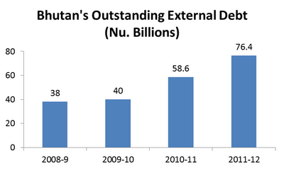
Article #1: Debt-GDP ratio gone through the roof (Kuensel, Aug 22, 2012)
 |
The story that I see is a an increase over the years, with a huge increase in the last year. But is this the correct story? Here's a less-jazzy chart of the same data. The main difference is that the bar heights are meaningful: they represent the debt amount. You might not have noticed, but the heights of the money sacks does not correspond to the debt amount (look at the 38B sack height, for instance). So the real story is that debt amount have increased over the years, but the largest jump is from 2009-10 to 2010-11 (Nu. 18.6M increase).
Let's look at another infographic. What is the story here? How has bandwidth increased over the years?
Article #2: Look forward to net surfing @ speed of thought (Kuensel, Aug 25, 2012)

Let's look at another infographic. What is the story here? How has bandwidth increased over the years?
Article #2: Look forward to net surfing @ speed of thought (Kuensel, Aug 25, 2012)
 |
Something is happening in 2012. But when? And how much? Notice that the timeline starts from right (1999) to left, which is the opposite of what we're used to. Next, have you noticed that some years are missing? where is 2011? what about all the years between 1999 and 2006? Let's compare the bandwidth figures: If Kbps, Mbps and Gbps are not your native language, it is quite difficult to compare the numbers at a glance, even with the conversion table given at the top. Here's a simple line chart of the same data that avoids all these pitfalls. We can see exactly which years have data, the correct timeline, and the height represents bandwidth on a single scale. I also made sure to mark the projected number in red.

Now, to our last example of BNB share value:
Article #3: Bonus shares trigger heightened trading (Kuensel, Aug 25, 2012)

Now, to our last example of BNB share value:
Article #3: Bonus shares trigger heightened trading (Kuensel, Aug 25, 2012)
 |
The story here is confusing: what does the height of the yellow area represent? For example, in the last period (Aug 16-24), why is there an increase? Dividing the data into six periods with six yellow strips gives the impression that we're looking at 15-day aggregated numbers. But since the yellow strips are not simply bars, they are probably not at all aggregated numbers. Maybe they are daily share values? If so, then why does the chart display 15-day periods? Confusing!
Unfortunately, I do not have the daily BNB share value figures, so I cannot create a 'good' chart of these data. But here's what I'd do: create a simple line graph of the daily value. I would not confuse this chart with 15-day figures (if that's needed, it can be conveyed in a separate 15-day value line graph).
I saw your effort in trying to educate us in effective display of information for quite sometime. And I saw you used the examples from Kuensel often but Kuensel is so unwilling to change. it keeps repeating the same old mistake for the sake of style.
ReplyDeleteBut I gain something out of you Galit! Thanks!
Good article but one correction: your bandwidth line graph should be labeled as Mbps, not Kbps.
ReplyDeleteThanks Bonita. The label is now fixed.
ReplyDelete