Interpreting data is first done with our eyes. If you deal with data in your job, you may want to expand your knowledge to state-of-the-art techniques and tools for visualizing your data.
I will be instructing the online course Interactive Data Visualization, starting this Friday, April 29. The 4-week course is fully asynchronous, so there is no specific time that you must be online. Each week includes materials to view online and offline (including videos, online resources, and more), and a hands-on assignment that you can complete at your own pace and receive feedback. Participants can post questions and have discussions with the instructor on an online discussion board. The course will require around 10 hours per week. You can find more details here.
The course was designed and is taught by myself (Professor of Statistics and Data Mining) and Dr. Catherine Plaisant (expert in human-computer interaction and user interface design) from the University of Maryland.
This is a great opportunity to interact with other participants world-wide and to experience the potential of online learning. You can also obtain a "certificate of course completion".
Feel free to email me for more information and for the special terms for Drukpas.
Tashi Delek,
Prof Galit
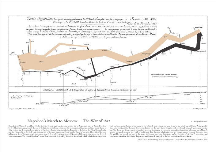 |
| Graphic depiction of the shrinking size of Napoleon's army (width of strip) as it progressed into Moscow and back. From http://www.edwardtufte.com |
May i know, what exactly in "Interactive data visualization".
ReplyDeleteCheers
You can read about data visualization here: http://en.wikipedia.org/wiki/Data_visualization. Interactive data visualization is the more advanced and powerful set of methods and tools for exploring your data interactively. For example, easily zooming in and out of a plot, choosing certain points on a plot to see more details on those data points, and much more.
ReplyDelete